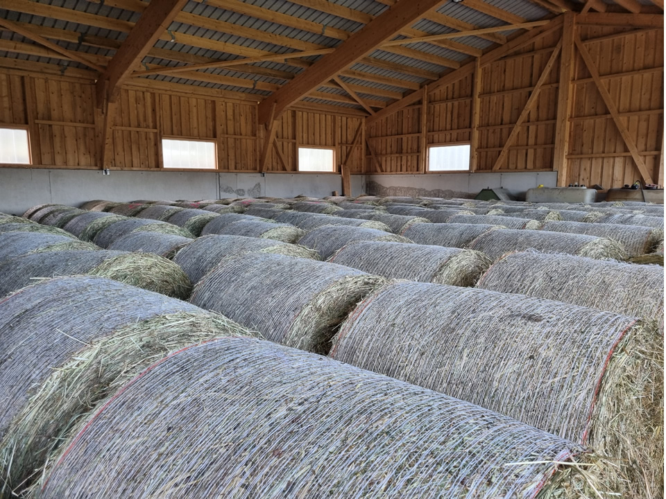
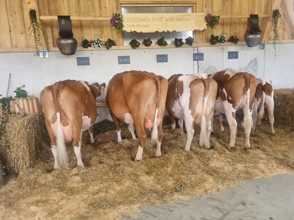
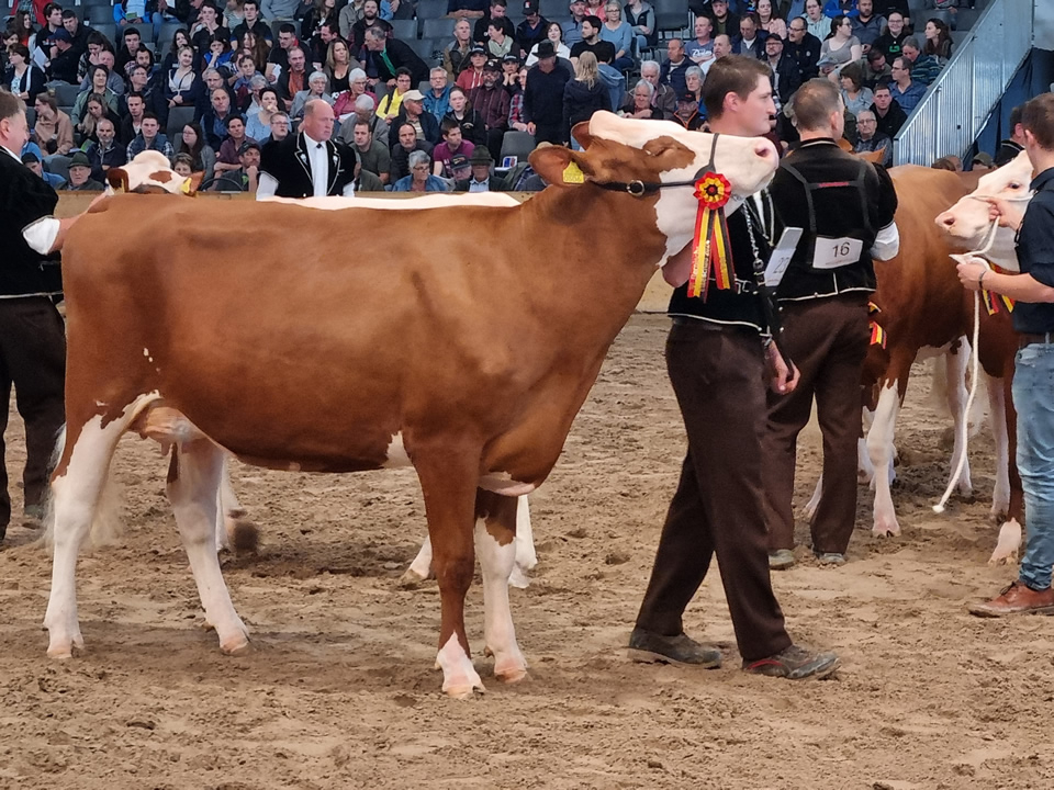
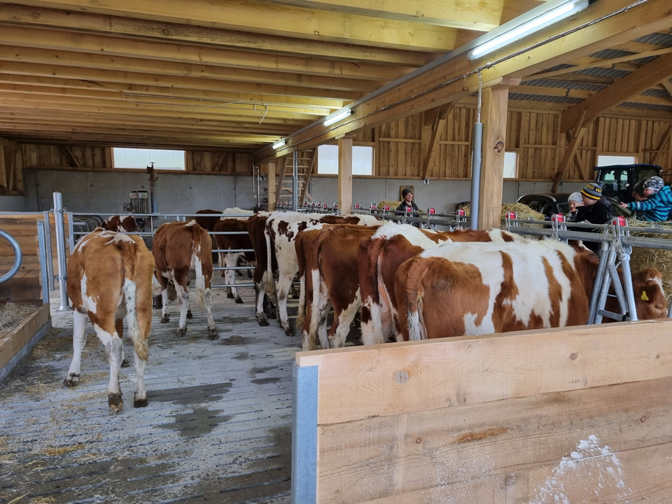
Sömmerung Alpbiglen, Gusti geladen für die schnellsten 90 Tage vom Jahr...
Module Positions
There is a total of 54 available module positions all of which are fully collapsible. By default your module widths will automatically adjust depending on the number of modules published within its containing row however within the templates parameters you can disable this feature and customise the width of each individual module.
Utility Classes
A utility class is a class that defines a set of methods that perform common, often re-used functions. Your template includes a number of helpful utility classes to help style your content. In Joomla there is a number of different methods of adding a class name to an element..
Inline Styling
The most basic method is inline directly in to the HTML of your document. Note that this method is only used when your are viewing the HTML source of your document either via the CodeMirror editor or the source/HTML option available in most other editors. An example would look something like the following....
<h2 class="padding-bottom-40">
    A Sample Heading
</h2>
The above class name of padding-bottom-40 will add a padding (space) of 40px to the bottom of the text.
Module Class Suffix (Module)
This method is specific to modules. If you click in to the settings of any module and select the 'Advanced' tab you will notice a 'Module Class Suffix' field. Simply add the utility class to apply the CSS of this class to the enitre module. An popular example would be the utility class 'text-light' which will convert all the text within a module to white which you will find useful if you have a dark background image or color set for the module area background. Note you can add as many classes as you like by simply separating them with a space.

Link CSS Style (Menu Items)
This final method is specific to menu items. Clicking in to the settings of any menu item (Menus -> [YourMenu] -> [YourMenuItem]) and selecting the 'Link Type' you will notice a 'Link CSS Style' field. This will allow you to apply a class to that particular menu item.
Text/Icons Color Classes
| Class | CSS Property |
|---|---|
| text-light | All containing text/icons is light |
| text-dark | All containing text/icons is dark |
Padding & Margin Classes
| Class | CSS Property |
|---|---|
| padding-top-0 | padding-top: 0px; |
| padding-top-5 | padding-top: 5px; |
| padding-top-10 | padding-top: 10px; |
| padding-top-15 | padding-top: 15px; |
| padding-top-20 | padding-top: 20px; |
| padding-top-30 | padding-top: 30px; |
| padding-top-40 | padding-top: 40px; |
| padding-top-60 | padding-top: 60px; |
| padding-bottom-0 | padding-bottom: 0px; |
| padding-bottom-5 | padding-bottom: 5px; |
| padding-bottom-10 | padding-bottom: 10px; |
| padding-bottom-15 | padding-bottom: 15px; |
| padding-bottom-20 | padding-bottom: 20px; |
| padding-bottom-30 | padding-bottom: 30px; |
| padding-bottom-40 | padding-bottom: 40px; |
| padding-bottom-60 | padding-bottom: 60px; |
| padding-horiz-10 | padding: 0 10px; |
| padding-horiz-20 | padding: 0 20px; |
| padding-horiz-30 | padding: 0 30px; |
| padding-horiz-40 | padding: 0 40px; |
| padding-horiz-60 | padding: 0 60px; |
| padding-vert-10 | padding: 10px 0; |
| padding-vert-20 | padding: 20px 0; |
| padding-vert-30 | padding: 30px 0; |
| padding-vert-40 | padding: 40px 0; |
| padding-vert-60 | padding: 60px 0; |
| Class | CSS Property |
|---|---|
| margin-top-0 | margin-top: 0; |
| margin-top-5 | margin-top: 5; |
| margin-top-10 | margin-top: 10; |
| margin-top-15 | margin-top: 15; |
| margin-top-20 | margin-top: 20; |
| margin-top-30 | margin-top: 30; |
| margin-top-40 | margin-top: 40; |
| margin-top-60 | margin-top: 60; |
| margin-bottom-0 | margin-bottom: 0; |
| margin-bottom-5 | margin-bottom: 5; |
| margin-bottom-10 | margin-bottom: 10; |
| margin-bottom-15 | margin-bottom: 15; |
| margin-bottom-20 | margin-bottom: 20; |
| margin-bottom-30 | margin-bottom: 30; |
| margin-bottom-40 | margin-bottom: 40; |
| margin-bottom-60 | margin-bottom: 60; |
| margin-horiz-10 | margin: 0 10px; |
| margin-horiz-20 | margin: 0 20px; |
| margin-horiz-30 | margin: 0 30px; |
| margin-horiz-40 | margin: 0 40px; |
| margin-horiz-60 | margin: 0 60px; |
| margin-vert-10 | margin: 10px 0; |
| margin-vert-20 | margin: 20px 0; |
| margin-vert-30 | margin: 30px 0; |
| margin-vert-40 | margin: 40px 0; |
| margin-vert-60 | margin: 60px 0; |
Background Color Classes
| Class | CSS Property | Color |
|---|---|---|
| background-white | color: #FFFFFF; | |
| background-black | color: #000000; | |
| background-gray | color: #888888; |
| Class | CSS Property | Color |
|---|---|---|
| background-gray-dark | color: #333333; | |
| background-gray-light | color: #cccccc; | |
| background-gray-lighter | color: #ebebeb; |
It is worth noting that we have not used !important with any of these classes, therefore if you apply a utility class to an element that has !important CSS styling applied to it then this styling will not be overridden.
If you like this feature please let us know in our forums and we will extend on this in future template releases!
Grid Gallery
Included with this template is the excellent Grid Gallery module extension. This stylish portfolio extension is an ideal solution to showcase site content in to attractive image boxes which can then be linked to further articles within your site. This extension is styled specifically for this template so it will blend seamlessly with the rest of the styling on your page.
Easily add title and description text for each image using the corresponding fields. Responsive options allow you to easily set the image box width depending on the device it is been viewed on. Multiple color choosers allow you to style the different elements of boxes to your own taste. And finally an 'On Scroll Animation' field allows you to easily add any of the animate classes included with the template to animate the image box as it is scrolled in to view within the browser window.
Thumbs Gallery
Our ThumbsGallery module extension allows you to easily create a simple and stylish thumbs gallery module in to any module position on your site. A thumbs gallery is an excellent way to showcase your images in an elegant and space efficient manner.
To set up your Thumbs Gallery module simply point the module to the image folder of your choice and the module will do the rest. The module will automatically create thumbs for each of your images, linking them to the original image in a stylish, easy to navigate lightbox.
Font Awesome
Font Awesome is a pictographic language of web-related actions which delivers over 300 icons. The Font Awesome webfont and CSS files are licensed under CC BY 3.0 and you can find the full examples of usage at Font Awesome - http://fortawesome.github.com/Font-Awesome
Add class fa-CLASS_NAME to any element, best used with a <span>.
Can also be added to any menu item using the Link CSS Style field in your menu item settings or to a module title using the Header Class field in your module settings.
