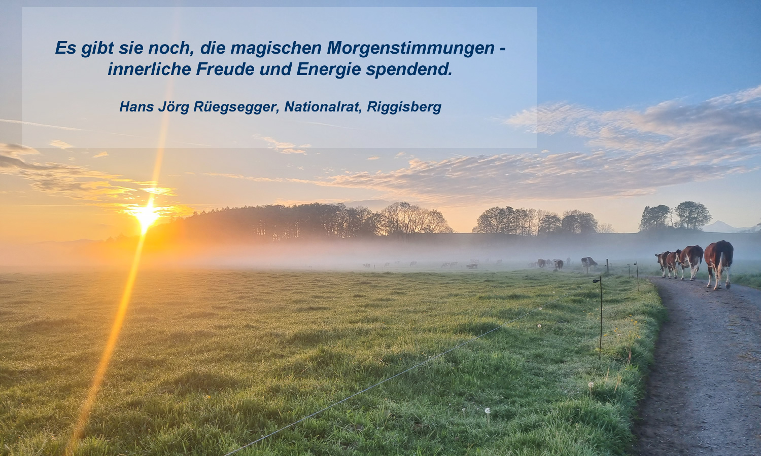
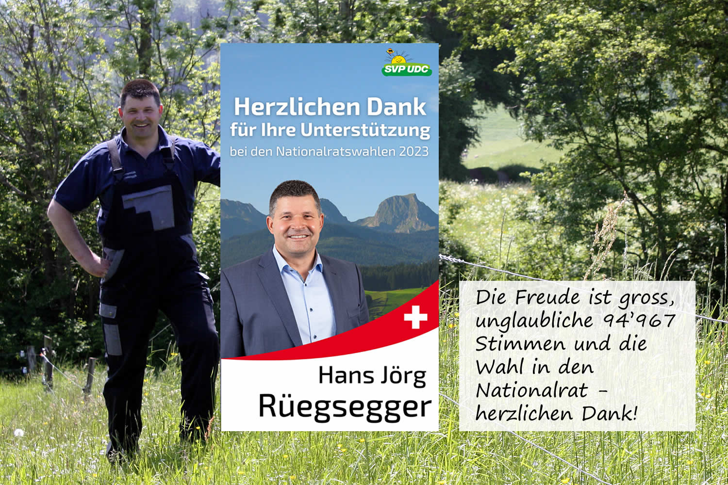


Sömmerung Alpbiglen, Gusti geladen für die schnellsten 90 Tage vom Jahr...


Module Variations
This template comes with different module styles and icons. For each module you can pick a style and combine it with an icon creating your own unique look.
You can set your module style via the Module Class Suffix field within your modules parameters. Navigate to Extensions -> Module Manager -> [YourModule] -> Advanced Options -> Module Class Suffix.
Typography
Heading1 (h1) looks like this
Lorem ipsum dolor sit amet, consectetuer adipiscing elit, sed diam nonummy nibh euismod tincidunt ut laoreet dolore magna aliquam erat volutpat. Ut wisi enim ad minim veniam, quis nostrud exerci tation ullamcorper suscipit lobortis nisl ut aliquip ex.
Heading2 (h2) looks like this
Lorem ipsum dolor sit amet, consectetuer adipiscing elit, sed diam nonummy nibh euismod tincidunt ut laoreet dolore magna aliquam erat volutpat. Ut wisi enim ad minim veniam, quis nostrud exerci tation ullamcorper suscipit lobortis nisl ut aliquip ex.
Heading3 (h3) looks like this
Lorem ipsum dolor sit amet, consectetuer adipiscing elit, sed diam nonummy nibh euismod tincidunt ut laoreet dolore magna aliquam erat volutpat. Ut wisi enim ad minim veniam, quis nostrud exerci tation ullamcorper suscipit lobortis nisl ut aliquip ex.
Heading4 (h4) looks like this
Lorem ipsum dolor sit amet, consectetuer adipiscing elit, sed diam nonummy nibh euismod tincidunt ut laoreet dolore magna aliquam erat volutpat. Ut wisi enim ad minim veniam, quis nostrud exerci tation ullamcorper suscipit lobortis nisl ut aliquip ex.
Heading5 (h5) looks like this
Lorem ipsum dolor sit amet, consectetuer adipiscing elit, sed diam nonummy nibh euismod tincidunt ut laoreet dolore magna aliquam erat volutpat. Ut wisi enim ad minim veniam, quis nostrud exerci tation ullamcorper suscipit lobortis nisl ut aliquip ex.
<pre> or <div class="code">
To display note use: <p class="note">Sample of your note !</p>
To display pin note use :<p class="pin">Sample of your pin note !</p>
To display clip note use:<p class="clip">Sample of your clip note</p>
To display download note use:<p class="down">Sample of your download note</p>
Ordered List
- Lorem ipsum dolor sit amet consectetur
- Lorem ipsum dolor sit amet consectetur
- Lorem ipsum dolor sit amet consectetur
Un-Ordered List
- Lorem ipsum dolor sit amet consectetur
- Lorem ipsum dolor sit amet consectetur
- Lorem ipsum dolor sit amet consectetur
Un-Ordered List witch class="tick"
<ul class="tick"><li>Your list item goes here!</li></ul>
- Lorem ipsum dolor sit amet consectetur
- Lorem ipsum dolor sit amet consectetur
- Lorem ipsum dolor sit amet consectetur
Un-Ordered List witch class="star"
<ul class="star"><li>Your list item goes here!</li></ul>
- Lorem ipsum dolor sit amet consectetur
- Lorem ipsum dolor sit amet consectetur
- Lorem ipsum dolor sit amet consectetur
Un-Ordered List witch class="plus"
<ul class="plus"><li>Your list item goes here!</li></ul>
- Lorem ipsum dolor sit amet consectetur
- Lorem ipsum dolor sit amet consectetur
- Lorem ipsum dolor sit amet consectetur
Blockquote
<blockquote><p>Your list item goes here!</p></blockquote>
Lorem ipsum dolor sit amet, consectetuer adipiscing elit, sed diam nonummy nibh euismod tincidunt ut laoreet dolore magna aliquam erat volutpat.
Emphasis Tags
<em class="highlight black">your text</em>
An emphasis tag that allows you to highlight some text in black.
<em class="highlight blue">your text</em>
An emphasis tag that allows you to highlight some text in blue.
<em class="highlight red">your text</em>
An emphasis tag that allows you to highlight some text in red.
<em class="highlight green">your text</em>
An emphasis tag that allows you to highlight some text in green.
<em class="highlight yellow">your text</em>
An emphasis tag that allows you to highlight some text in yellow.
Image Frames
<img src="/images/yourimage.jpg" class="frame-1"/>

<img src="/images/yourimage.jpg" class="frame-2"/>
Template Styles
There is a total of 6 color styles available giving your the template flexibility in match the color scheme best suited to your needs. Color styles available are Black, Red, Blue, Green, Bronze and Purple and can be set by navigating to your templates parameters (Extensions -> Template Manager -> J51 [Template Name] and simply selecting the color style of your choice from the 'Template Style' dropdown menu.

Layout Options
Easily adjust your templates widths and column layout via the Layout Options section of your templates parameters which can be accessed by navigating to Extensions -> Template Manager -> J51_YourTemplate.
Set you template width using the appropriate field in pixels. By default this is set to 1080 which sets your template width to 1080px.

From your 'Side Column Layout' buttons simply set the layout of your side columns in relation to your site content with options for both your side columns to appear on either the left or the right or on either side of your content/component area.
For a single column layout simply disable all modules in the sidecol-a and sidecol-b module positions.
Your side column widths can also be customised via this section. Place the desired width of your side column by percentage in the Side Column Width field. Your content area will automatically contract/expand to fill the remaining available area.
Template Parameters
With a new and improved template parameters we have combined some of the most used and asked for features within an easy to use and beautifully styles interface. With these parameters you can now quickly customise your template to your own needs and have your site up and running in a matter of minutes.
Your template parameters can be access directly from your Template Manager giving you access to a host of features including a selection of template styles, some colour choosers to help customise your template headers and links, a number of layout options and easy to use logo settings.


